It was a beautiful Friday night and the plans were set. Our friend Aline was swinging by the pad to pick us up. We showered and donned our jeans and nice shirts for a cool evening on the town. (Luiz warned me it may be getting cool) She arrives right on time and we are off to see what lies ahead for us at the CASA COR GOIAS . -- This interior design/ architect showcase is celebrating its 15th year in Goias and 25th years country wide. With its theme “Day to Day with Technology” it promises to show us splendor, functionality, and intelligence with a hint of over indulgence. The exhibition is well known throughout Brazil as it holds similar expos in other cities throughout the country. In Goiania the show runs for 39 days (May 13 to June 21) and showcases 47 conceptual environments created by 66 professionals in the design community.

We stop to pick up Aline’s mom and off we head to the other side of town. Pleased that we find a parking spot relatively close (not very easy most of the time, like in most large metropolitan areas worldwide), we take the short block walk to the venue. Arriving at the Merzian Space (which is actually a space built by the Merzian construction company as a sales office) I find the venue very inviting with it large glass face and well landscaped front lawn. We pay our R$30.00 (which to me seemed quite inexpensive) and are ready to see what Goiania has to highlight regarding interior design.
Upon entering into the first room designed by: Fatimah Mosque, Marcia Albieri, Regina Amaral. We are slapped in the face with this year’s theme “Day to Day with Technology” (the good kind of face slap but a little over dramatic for reality). With its Alice in Wonderland overtones,
We walked through the rest of the show admiring all the creativity and adding some additional thoughts and ideas. Since I made a competition out of the wedding show in my last blog by choosing my top table design and then giving a nod for honorable mention. I thought about doing the same for this event.
The living room and kitchen designed by Genesio Maranhao was very intriguing to me. My first impression of the living room was that it felt cluttered as I love simple and clean lines, but as I spent a little time I came to enjoy it. Full of shelves filled with nic nacs for both use and the sheer pleasure of viewing. The white couches had beautiful pillows with a hint of pink adding just the right sprinkling of color to the black, brown, gray, and white surroundings. Then my eyes caught a glimpse of the kitchen area. Hidden off in the corner the orange theme kitchen complete with orange fridge and cupboards felt fresh and different adding another intriguing element to the design. I had now changed my mind from my first impression, however, there is one element that I just could not overlook as being out of place (in my unprofessional opinion). That was the cheap looking pink plastic chairs they had staged in the living room area. I am sure some people found this attractive but to me it just did not fit into the rest. These chairs would have to go!
The next area to be highlighted as a favorite of mine would be the Kitchen designed by architect Laciana Taquary. It found its inspiration in the cerrado or more specifically the pequi. The minimalist design showcases the pequi flower, fruit, and tree. Wait a minute you say… “What is pequi?” Pequi is a fruit that grows in central Brazilian’s cerrado region. So, a fruit to inspire a kitchen design is average you say. However, this fruit is found mainly in the state of Goias (plus a little surrounding area). The taste is quite strong and it is definitely something liked by local Goianos and most non locals find it hard to swallow. It also has an unusual aroma that mixes sweet, fruity and cheesy. It can be ate raw (which I have not tried) or often it is cooked in rice or a local chicken dish. (which I have tried and trust me the flavor is quite strong but my vote on whether I like it or not is still out). After visiting the kitchen inspired by the fruit I decided to find out more. In my research I found out it has a beautiful flower (which does not smell good) that blooms during the night in the winter (July- September – I am going to try and find a tree and see this flower). The seeds of the tree can be roasted and locally they are favored more then Brazilian nuts. But, I have transgressed away from the design show a little so let's return. The kitchen is anchored by huge back lit mural of the pequi tree. The island work area with its yellow pequi adding just the right amount of fresh yellow color (I love yellow in the kitchen) to the silver, white and black elements. Detailed black etching of the pequi flower on white back splash tile added the finishing touch.
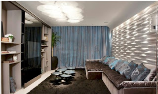
Since the theme had to do with technology there were quite a few entertainment rooms. The second home cinema to make my top list was designed by Anna Maria Miller. Its basic gray and lead tones with a dash of turqoise accent, was prefect to invite you to lounge around all day and watch a movie or two. The wall had a clean contemporary look that was faultlessly accented with white lighting. Upon entering the room, I quickly envisioned curling up on the oversizes sofa to watch a great movie.
The final design that sticks out to me is actually the last creation in the show. The restaurant space designed by Andre Brandao and Marcia Varizo. They really could not go wrong with their choise of monochromatic reds in my book (I love red!). This red incorporated throughout the space was well thought out and coordinated in the spaced to provide functionality along with eye pleasing accessories. The only concern I had was the number of things, as it seemed a little cluttered for my simple tastes. It was inviting and we briefly discussed having dinner there (yes they do serve dinner), but opted for the restaurant across the street. (I will get to that later)
I cannot leave the interior design show without giving a call out to some other elements that I really enjoyed: the star lit wall in the baby’s room using fiber optics, the swivel chair the room host had me sit in and ask that I trust him as he swung me around, all the different wall materials used to create interest and intrigue out of a simple ordinary wall, the office wall with its diagonal display
 of similar events “Street of Dreams” – “House Design” that I have attended in the United States and I look forward to coming back again to admire the creativity of these Brazilian designers.
To end this blog and the evening, we take a quick trip across the street where we find a table to eat dinner and enjoy the rest of the evening. the conversation is centered around the designs we saw and digesting out thoughts. We were close enough to watch people heading to the COSA COR and were happy we went early as it soon became obvious this event was destination for a lot of people this evening. We enjoy our food and the rest of our evening with friends and until next year – decorate creatively.
(Read my review of the wedding show)


